In short
A marketplace product infographic is not decoration on top of a photo. It is the substitute for a salesperson standing next to the shelf. A shopper on Amazon or Etsy cannot pick the product up, and on mobile they are not going to scroll down to a wall of bullet text either. They swipe through five to nine images in a few seconds and decide, from those images alone, whether the listing is worth opening further. If slide two or three does not answer their actual question — size, what's in the box, who this is for, how it compares to the obvious alternative — they bounce to a competitor selling the identical item with a clearer picture.
Below is how the slide sequence usually works, what AI image generation can and cannot reliably do for this specific job in 2026, and the mistakes that quietly cap conversion even on otherwise good products.
Why the same product loses to a better picture
Baymard Institute's eye-tracking research found that the large majority of online shoppers evaluate product images before they read any description, and that share is even higher on mobile. None of that is about the product being better. It is about whether the shopper's question got answered inside the image, not buried in a spec table three taps away.

Source: the official Wildberries product photo rules, public page captured in July 2026.
Amazon's own product image guide is a useful proxy for how strict this has become: the main image has one job, and secondary images carry the explanatory work. Features, materials, sizing, what's included, how it compares — that is where most sellers under-invest.
The slide sequence that actually holds up
There is no single template that fits every category, but listings that convert consistently tend to follow the same rough order.
Slide 1 — the clean hero shot. This is not really an infographic, but it decides whether anyone clicks through from search. Product fills most of the frame, background is neutral, no text overlay — Amazon enforces this directly, and Etsy and Shopify buyers respond to it even where it is not a hard rule.
Slide 2 — the one differentiator. A single claim in large type: the reason to pick this over the ten nearly identical listings next to it. Not "premium quality," but "40-hour battery life" or "machine washable at 60°C."
Slides 3-4 — specs and use case. Materials, dimensions, capacity, what it is actually for. This is also where returns get decided. Apparel and footwear listings that skip a real size chart — actual measurements, not just S/M/L — carry a structurally higher return rate, and that shows up directly in account health metrics on most platforms.
Slides 5-6 — what's in the box and support. Included accessories, charger or cable, instructions, warranty terms, who to contact if something breaks. This is the slide that reduces pre-purchase questions and post-purchase disputes at the same time.
Slides 7-9 — comparison and proof. A "this vs. the generic version" table, a real customer quote, the product in actual use. Do not invent numbers or slap on an unearned "#1 bestseller" badge — marketplaces increasingly flag misleading infographics, and shoppers who cross-reference two listings catch it fast.
The rule that holds across categories: one slide, one idea. The moment a single image tries to carry two separate messages, mobile readability drops and neither message lands.
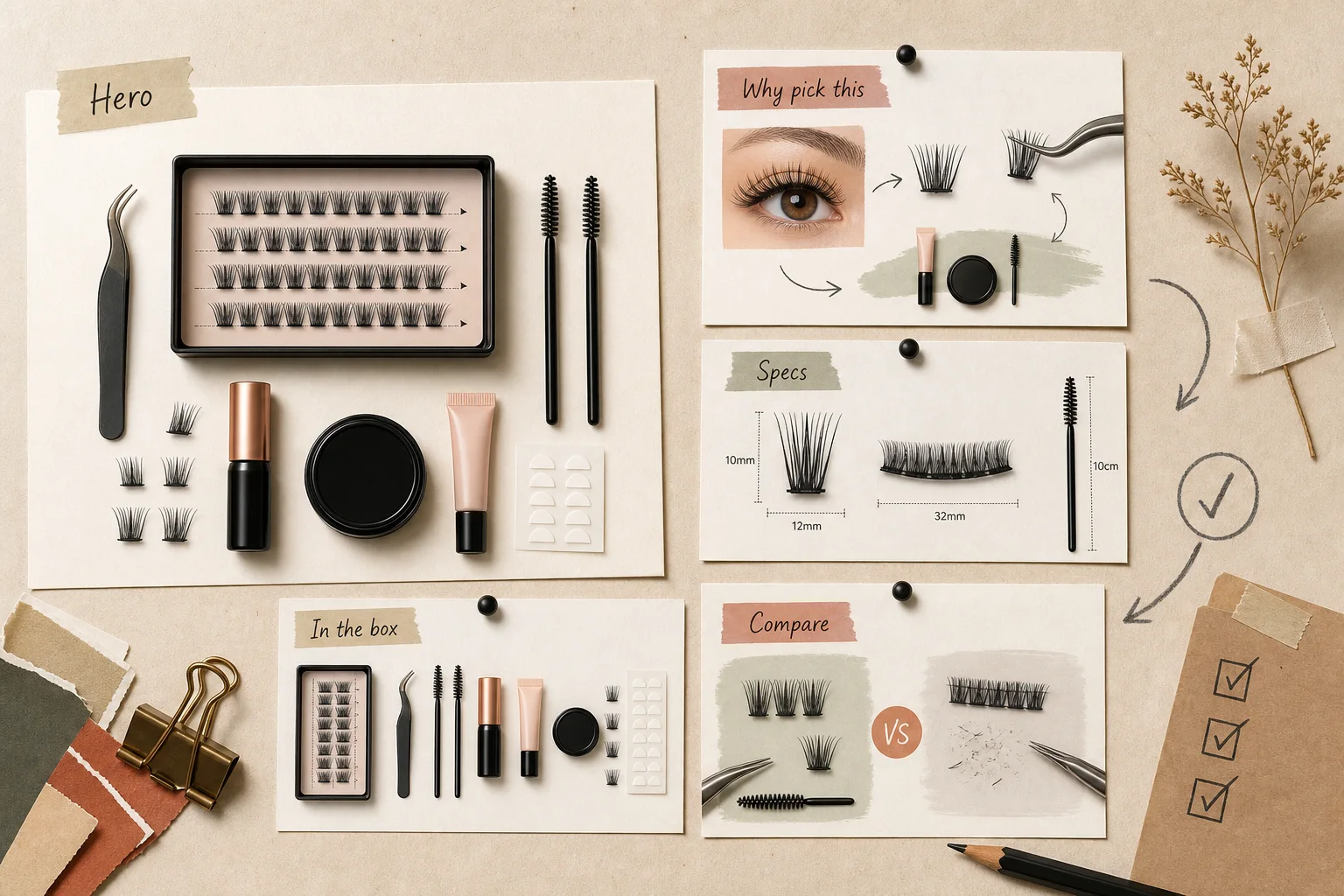
Example: a lash-kit product gallery
Beauty listings make the difference between "pretty" and "useful" especially visible. The lash-kit slides below answer several buyer questions at once: what comes in the set, which specs matter, what the glue and fixer look like, and whether a beginner can apply it.

The strongest move is showing the whole kit on one slide. A shopper sees glue, fixer, tweezers, lashes, and cluster count instead of an abstract "set." That also protects the listing from expectation mismatch: if the product is sold as a bundle, the gallery should show the bundle.

The second slide answers technical questions: curl, lengths, thickness, and wear time. This is not the place for generic "premium quality." A lash buyer wants specifics: whether the length will suit the eye, whether the band will be visible, and whether the set is beginner-friendly.

The third slide is weaker: it looks good, but adds fewer facts. "Instant bond" and "clean hold" sound pleasant, but without set time, ingredients, or a warning for sensitive eyes, the slide is mostly advertising. It can stay if the gallery has already answered the factual questions before it.

The fourth slide works because it reduces fear. The buyer understands that they do not need a professional, only three simple steps. But instruction slides must use especially large type. If the text reads only on desktop, it is not useful on a marketplace.
Where AI generation actually helps, and where it still doesn't
Tools like ChatGPT Images, Canva Magic Studio, Adobe Firefly, and similar image models have gotten genuinely useful for the repetitive part of this job: draft layouts in seconds, background variations, swapping a scene for a seasonal campaign, generating lifestyle backgrounds without a photo shoot. For a seller managing a few hundred SKUs, that alone saves real production time. At that scale, product graphics become part of the wider AI retail operations problem: catalog data, approvals, stock context, and brand rules have to move together.
The catch is that these models are still unreliable at the part of an infographic that matters most: exact on-image text, a product's true proportions, and staying consistent with a brand's visual system from listing to listing. Ask an image model for "a bar chart showing feature comparisons" and you are as likely to get elegant nonsense — garbled characters, a size chart with numbers that don't add up — as you are a usable graphic. That is a structural limitation of current generative image models, not a one-off glitch, and it is precisely the part of the image a shopper is relying on to make a decision.
The workflow that actually holds up in production: let the model generate background, composition, and style, then place exact text, numbers, and tables on top in a proper editor with real typographic control. That keeps the speed of AI generation without shipping a size chart nobody can read.
We build this kind of pipeline as part of our AI video and ad creative work: matching tools to a specific catalog, locking in brand constraints — fonts, colors, mandatory disclosures — and setting up a repeatable process so a few hundred listings follow one template instead of being reinvented one at a time. Past a certain catalog size, this stops being a design question and becomes a production question: who approves the layout, where does the brand guide live, how fast can a listing update when price or contents change.
The mistakes that quietly cost conversion
The most common one is a hero image with no clear focal point — the product just sits in frame, and all the actual information is pushed down into a description most mobile shoppers never reach.
Second is text set too small to read on a six-inch screen, which is where most marketplace traffic actually happens.
Third is a style mismatch with the buyer: a clinical, spec-heavy layout for a product that gets bought on emotion, or the reverse — soft lifestyle styling on a listing for a power tool.
Fourth is missing sizing or capacity information in categories where it directly drives returns — apparel, footwear, cookware, furniture.
Fifth is an infographic copied almost exactly from a competitor on the same platform. Marketplace review teams catch this, and shoppers who have seen both listings lose trust in whichever one looks derivative.
Sixth, specific to AI generation, is shipping unedited model output straight to the listing — warped proportions, unreadable text, a stray artifact in the corner that looks like a logo. Every generated image needs a human check on an actual phone screen before it goes live, not just a glance on a wide designer monitor.
What to measure to know if it's working
Watch three numbers, not whether the images "look good": listing conversion rate, category return rate, and time-to-first-order after a photo set changes. This is the same discipline as AI sales funnel analysis: measure where the buyer gets stuck, then change the asset that should remove that friction. If conversion hasn't moved one to two weeks after an infographic refresh with stable traffic, the slides are not answering the shopper's real question — check the Q&A and reviews section, because the missing information is usually spelled out there in plain language.
It also helps to revisit platform image policy on a schedule. What passed review in 2023 can get flagged today; marketplace enforcement on misleading claims and image quality has tightened steadily.
If a catalog is growing faster than a designer can keep up, it is worth treating this as a small production system from the start — templates, a brand guide, a clear update cycle — rather than a pile of one-off graphics. That is the kind of problem a focused build with a visible result is suited for: the payoff comes from how fast new listings ship, not just how polished any single one looks.
FAQ
How many infographic slides does a product listing need?
Most Amazon and Etsy listings do well with seven to nine images total: one clean hero shot plus six to eight infographic slides covering the differentiator, specs, contents, and comparison.
Can AI generate the whole infographic without a designer?
It can handle the draft layout and background reliably. Final text, numbers, and tables still need a human pass — current image models are unreliable at rendering exact on-image text, especially small type and tables.
What image size should I use for marketplace listings?
A practical baseline is a 2000x2000px square, since most platforms recommend the product fill 85% or more of the frame and crop or resize aggressively for thumbnails. Keep key text and numbers away from the edges.
Is text on the main product image allowed?
On Amazon, no — the main image must be clean, with no text or logo overlay, or the listing risks suppression. Etsy and Shopify are more permissive, but a clean hero image still performs better in search results across all three.
If a catalog has grown past the point where redoing infographics by hand is realistic, the better fix is usually a generation-and-approval pipeline built once — so a price change, a new season, or a new SKU takes hours to update instead of another round with a designer.